
Color affects people so much. Color can make us happy or sad, frightened or calm and hungry and many more. Color can express the thinking of mind , it can explain some core and inner thoughts.
Color Theory
Color theory is something that studies how the color wheel works, it creates an impact on our mind and different brands as well. Color theory helps the designers to choose the correct color for various types of designs.
There are two types of colors
a. Primary colors &
b. Secondary colors
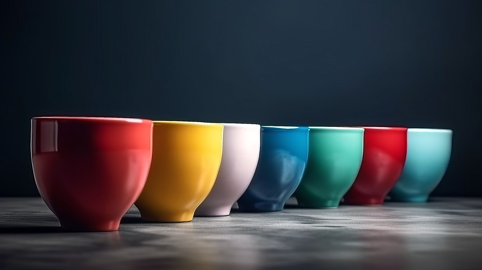
Primary colors are red, yellow and blue and the secondary colors are the mixing of primary colors. By using appropriate color contrast designers make eye-catching designs. To understand perfect color contrast we should know about color wheel.
When brands and designers design something for them they have to maintain their color by this wheel. They should balance colors for their logos, icons, company name, website, fonts. For such a thing we can see some brands name and logos to understand the color perfection.

Brands name & logos:
Logo is the symbol of a company by which a company is familiar to everyone. Logo should be bold, clean & simple. A logo seems eye catchy for its perfect design and color. On the image there has different types of logos some of them are written some of them are iconic. But in every logo we get the idea about the brands of the logo. They are perfectly color maintained, understandable and clean.
Color Harmonies:
It means the balancing of colors. It admires the color for various reason like color harmony says that we can use some types of colors for some types of purposes. Like as-
Red color is used for energy, alert and love.
Orange color is used for excitement, art and food.
Yellow color is used for happiness, stimulation and attention.
Green color is used for health, calmness and health.
Blue color is used for trust, loyalty and security.
Grey color is used for neutrality, communication and composure.
Black is used for power,discipline and elegance.
White is used for purity,cleanliness and light.
There are many more colors for design. Sometimes we should take our own colors to experiment with new trending designs.
.
Tips and tricks:
For branding at first we have to think about our expected audience and values of the brand. We need to choose the color palette according to the expectation of the consumers. Also brand needs to consider its product.
Brands should justify consumers’ taste. The appropriate color choice attracts people towards the brand.
1. If brands want to create something powerful both positive and negative they can use RED. Like something dangerous is marking with red, fast racing cars are famous in color of red and packaging of coca cola is red.
2. Secondly, lots of brands and businesses use the color BLUE in the means of serenity and calm. Blue is also use for trust and security purposes. It create trust worthy position in the market. Like hospitals uses blue as safety color, sky and ocean is the color of blue so it is a deep meaningful color as well. Many huge and famous brands choose their color as blue, like-Facebook, NIVEA, PayPal, SAMSUNG etc.
3. Moving on YELLOW, it is a very positive color. As we can see every emotional emojis are of yellow color. It reflects the happiness and sadness as well. It is a warm and very difficult color so brand should use it carefully. Brands like Macdonald, DHL, NIKON use yellow color.
4. Then we have a very eco friendly and natural color that is GREEN. For using the color you have to keep in mind that it represents refreshment and boredom it a same time. You should be thoughtful to pick the color green. AUSTRALIAN MADE,JOHN DEERE, Sprite, ANIMAL PLANET uses their brand color green.
5.Don’t forget the color ORANGE. Orange is a warm and vibrant color. Generally used in food, traffic, cartoons etc. It has positive side like confidence, courage and also has negative sides like frustrations, ignorance.
6.Now we are going to talk about the most powerful color and that is BLACK. The most luxury brands of the world use black color for their brand to make it bold and special. It makes the brand elegant and secured. High End brands like NIKE,CHANEL,PUMA.
7.After that there has a very reflecting color which is called WHITE. It put a clear and clean feel to the brands. The combination of black and white is the most gorgeous combination ever. ADIDAS, Apple, PRADA are mostly use white color for their brands. It looks very rich and polite at the same time.
8.Let’s talk about a darker color that is PURPLE. It’s a very ancient royal color. It’s a very moody color. Purple is more fashion brands color.
9.Now come to MAGENTA. It is a very eye catchy deep color. Mostly girly products are magenta color because it’s so vibrant. When any brands wants to work with female things they can choose magenta for their brand. Brands like Barbie, Priceline, ROXY, donut king use their brand color magenta.
So after discussing all the colors, brands have to understand which color is suitable for them and which color can express the brand to the expected audience. You need to research your brand color ,take your time to analyze the color combination for your brand.