You already have your business website up and running, and it’s generating leads, but how good is the conversion rate?
If 10 prospective customers visit your site, do 3 of them convert? If so, that’s pretty good, but it could always be better.
If you want to turn more website visits into sales, this article will help you do it.
We’ll discuss all the big and little things you can do to improve your conversion rate, including how to:
- Streamline the buying process
- Focus on the value you bring
- Deal with prospects’ objections
- Spur website visitors to act
- Create a sales funnel
- Respectfully dismiss the competition
- Address prospective customers’ risk
- Optimize your ad copy
- Perform A/B testing to maximize conversions
- Make the most of your testimonials and reviews
All that might sound a bit complicated, but don’t worry. We’ll break it down in a way that makes sense and give you a roadmap to improving your conversion rate.
Step 1. Simplify the Buying Process
When potential customers visit your website, it should be extremely easy for them to purchase your product or service. Too many choices, a confusing website layout, and complicated forms are all examples of unnecessary roadblocks in the buying process.
This section focuses on some of the ways you can streamline the path from the first contact to sale.
Focus on the UX
User experience, also known as UX, is at the center of how well a website performs. It’s the sense of value that a customer gets when they’re interacting with your site.
At its core, UX is important because its purpose is to fulfill the visitor’s needs. A positive experience promotes customer loyalty, and the more you control that experience, the better you’ll be able to convert website visits into sales.
Here are three UX-related changes you can make to increase your conversion rate:
- Use a familiar design. Your website visitors will only take about three seconds before deciding whether to stay or move on. Don’t throw them off with an over-designed or unconventional layout.
- Animate your site. Implement a customized cursor or include an animated GIF. Adding any sort of eye-candy to your site can help keep visitors around longer. Just make sure it’s not too distracting.
- Mix up your navigation style. You can encourage visitors to explore more of your site if you present them with a nonstandard navigation method. Bail on the conventional top nav menu in favor of a sidebar menu or visual cues that will guide readers through your content.
There are dozens of ways you can focus on UX to improve your conversion rate. If you put yourself in the mind of your prospects, UX will become less of a mystery, and you’ll be able to design your website to perfectly meet your customers’ needs.
Eliminate Jargon
When describing your products or services, don’t get too technical. Your prospects don’t have as much knowledge as you do about what you sell, and that’s OK. They’re more interested in value and results than minute details.
Even if using technical terms makes what you do sound more impressive, try to put yourself in the mind of the customer. Use layman’s terms so your prospects can easily understand what your products and services can do for them.
Remove Distractions
Your home page should clearly present a call to action (CTA), and if anything distracts from that goal, you should consider making a change. Remove elements that might pull focus away from your CTA. For example, if your navigation bar attracts more attention visually than your CTA does, you’ll need to change that.
Even if your sales strategy involves a few steps, not everyone will need to take all of them before they’re convinced to buy. If a prospect is already sold on your offering and you drag them through additional steps before they can purchase, that qualifies as a distraction.
In a multi-step sale process, every step should provide a direct path to making a purchase. That will ensure that clients that needed a little less convincing won’t get distracted and leave your site.
Make your CTA Stand Out
When a prospect visits your website, your CTA needs to jump out at them. Position it on the page so that no scrolling is required to see it.
Always use a button for your CTA instead of a simple link. Buttons draw focus, whereas a text link to your CTA can easily get lost in the other copy on your site. This suggestion is especially important to follow when you consider how your CTA appears on mobile devices.
Step 2. Emphasize Value
You must clearly explain the benefits of your product or service. You can list product features and describe services all you want, but unless the information directly translates to value in the mind of the customer, you’re just spinning your wheels.
Stress the value your product or service brings, avoid the urge to oversell, and ease the prospects’ minds with a quality guarantee. If you do those things, you’ll take a major step toward increasing your conversion rate.
Have a Compelling Value Proposition
Your prospects need to understand that your product or service will solve their specific pain. Your offerings may address a wide range of problems, but the typical customer has only one to solve, and solutions to that problem are literally all they want to hear about.
Tell your potential customers what they will get from you, explain what’s unique about your product or service, and mention how it’s superior to your competitors’ offering.
Avoid Hype
Don’t oversell. It will make you look desperate.
When you’re trying to attract new customers, you want to project an air of authority and indicate that you know how to solve your customers’ problems. An overly aggressive sales pitch is not the way to go.
You want to seem like a friendly expert that’s there to help. To give that impression, you need to act like you’ve been there before.
Keep your sales pitch dignified and grounded by using straightforward language that gets right to the point and helps your prospects make a purchasing decision.
Add a Guarantee
When a client has all the information they need about your product or service and is almost ready to make a purchase, telling them about your guarantee can be the final piece of the puzzle that makes them buy.
Nothing gives potential customers that warm and fuzzy feeling like the knowledge that you won’t leave them out in the cold if a problem arises. If you include an unconditional refund policy on all purchases, they’ll understand how thoroughly you stand by your products or services.
Step 3. Deal with Prospects’ Objections
Depending on what you’re selling, you may be battling prospects’ objections from the moment they hit your site. This section covers how you can generate some enthusiasm in your prospects and tweak your site to make buying from you so easy that visitors will have no reason to say no.
Get Visitors Excited
Not everything that’s marketed and sold online is exciting. Sure, you can order a brand-new Tesla on their website, but at some point, you’ll also have to surf the web for boring things like replacement toothbrush heads and vacuum cleaner bags.
When the average person needs to hire a plumber or buy a household product, they hit the web. It’s hard to get excited about mundane things, but it’s your job to make your products and services exciting.
While avoiding hype, use bold, emotionally-charged language that highlights the most interesting aspects of what you’re selling.
Offer Multiple Ways to Pay
Some people only want to pay with a credit card. Others prefer PayPal. Some may even want to write you a check. It’s so easy to offer multiple payment options these days, it would be silly to let such a trivial factor keep you from making a sale.
Think about your customer base and figure out which payment methods they are likely to prefer so you can satisfy the needs of all your prospects.
Simplify Registration or Eliminate It Completely
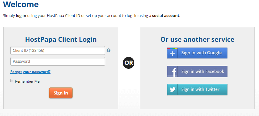
Forced registration as a condition of purchase can be an annoyance, and sometimes it will even raise suspicion. It’s like when the cashier asks for your phone number at the register. The question that goes through most people’s minds is, “What are you going to use it for?”
Instead of requiring that users complete a registration form in order to buy your product or service, make it optional. Offer an easy path to purchasing that lets customers know you respect their time and privacy.
If you do ask your customers for information at the time of purchase, request as little information as necessary. Make many of the input fields optional. Once you’ve established a relationship, you’ll have a chance to collect more information in the future.
Step 4. Create an Incentive to Act
When deciding to buy, some prospective customers get almost there and freeze. You’ve given them all the pertinent information, your product or service matches perfectly with their needs, but they still won’t pull the trigger.
This section offers a couple of suggestions about how you can win that goal-line stand and score a sale.
Offer Discounts at Checkout
When customers are almost ready to buy, one way to seal the deal is to offer a discount that they will only receive if they make a purchase. Free-shipping or a price break on their next order are proven winners.
Encourage a Sense of Urgency
If you’re selling a product, you can create a sense of urgency in the customer’s mind by convincing them that they might miss out if they don’t act fast. You can include an inventory count that shows very few units remaining in stock. “Don’t wait…only 3 left in stock”—we’d hate to admit it, but that old trick has worked on most of us at least once in the past!
Step 5. Establish a Sales Funnel
Have you ever coaxed a squirrel to take a nut from your hand? The key elements are time and no sudden movements. A sales funnel is a lot like that.
A common error that small- and medium-sized businesses make is attempting a two-step sales process, where Step 1 is initial contact, and Step 2 is the sale.
In a competitive market, that kind of sale doesn’t happen very often.
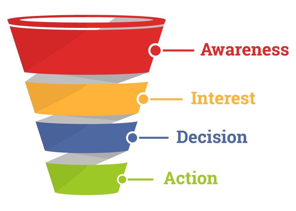
A good way to increase sales is to add extra steps that will give you time to win over your prospects. The purpose of a sales funnel builder is to close the gap between awareness and the first sale by constructing a well-designed sales funnel.
Build Awareness First
The first part of a sales funnel involves generating awareness. It’s your chance to explain who you are and say, “I’m here when you need me.”
While your goal is to drive traffic to your website, building awareness doesn’t always start online.
Prospects can become aware of your business through print ads, in-person contact at a local marketing event, or simply by seeing your logo on the side of a truck. Using a combination of online and offline marketing is a good strategy when you’re trying to let people know that you’re open for business.
Create Interest
The second part of your sales funnel involves creating interest.
The moment a prospect first becomes aware of your business is not always the best time to make a strong sales pitch. Potential customers need time to learn about your products or services first. For this, you’ll need their contact details.
Along with a promise to reach out with something that might help them, offer your prospects something of value in exchange for their contact information.
When you do reach out to them, you may have to remind the prospect of your existence, but your main purpose is to start building a relationship. By providing useful information about your products and services, you can slowly generate interest and clarify how your offerings can be of value.
You can use newsletters, blog posts, social media, or simply pick up the phone. One way or another, you have to make good on your promise to reach out with some sort of helpful interaction.
Don’t Rush to Make the Sale
Remember, you’re playing the long game here.
The first two steps of the sales funnel process can take a while. Creating awareness and generating interest are huge hurdles to clear, but once that’s accomplished, a slow approach is still the key to winning business.
You’ve provided helpful information that will move your leads one step closer to buying your product or service, but they’re not quite there yet.
By now, your potential customer has learned a lot about your business, but will likely still have some questions and concerns. Once you’ve addressed those concerns, get down to the nitty-gritty—clarify product details, pricing, payment options, and anything else that needs to be worked out before they buy.
After all the prospect’s questions are answered, you should be ready to close the sale. Having received such helpful personal attention, your lead will readily make the purchase.
Step 6. Prove You’re Better than the Competition
Hardly anyone looks at just one option when shopping for a product or service. Prospects are going to check out your competition, so it’s smart to head them off with your own take on how you stack up.
Seem Objective
If you slam your competitors, you may come off seeming petty, or worse, your opinion will appear as biased and self-serving. It’s best to add a little sugar to the vinegar.
There’s a way to mention your competitors without running them down. In fact, you can even point out something positive about them; the trick is to make sure it’s an extremely unimportant thing.
Redefine the Playing Field so You Win
When comparing your business to that of your competitors, you control the story. You get to decide what to emphasize in the comparison, and it should always be the areas you excel in.
In reality, there may be some areas where your competition has you beat. Downplay the importance of those areas or suggest that your offering is equivalent.
Beyond that, you’ll need to identify at least one aspect in which you can clearly demonstrate superiority over your competitors. Figure that out and hammer the point home.
Step 7. Eliminate the Customer’s Risk
It’s sad how many potential sales are lost because businesses fail to connect with their prospective customers. From their point of view, the client is dealing with unwanted risk, and it’s your job to ease their mind. Creating a lasting relationship with your customers is the only path to eliminating that sense of risk, generating repeat business, and expanding your client base.

Establish Trust
By the time you’ve become a customer’s trusted supplier, you have established a relationship with them, but it takes some effort to get there. The key is to establish trust and then serve your customer in a way that constantly reinforces that trust.
You’ll find that, after gaining the confidence of your clients, you will be able to grow your business at a pace that you might not have anticipated. Earning their loyalty will give you the confidence to expand your product line with offerings that are specifically targeted toward your customers’ needs. You’ll feel more comfortable about soliciting testimonials and even about raising your prices.
Offer Proof of Quality
Quality is a moving target. For some consumers, quality is defined exclusively by the effectiveness of a product or service. On the other hand, some users may see an environmentally unfriendly product as having low quality even if it serves its purpose very well.
When you need to emphasize that you’re providing high-quality products and services, it pays to understand your customers’ needs and values. Armed with that understanding, you’ll be able to frame your quality claims in a way that will resonate with your target audience.
Include a Privacy Statement with All Forms
People are concerned about the security of their information on the web. There’s no changing that, so it’s best to get out in front of it.
Link to your privacy statement so it’s easy to find and ensure that the statement is professional. It should contain all the assurances that are appropriate for the level of information your prospects will be sharing with you.
Step 8. Conduct A/B Testing
One of the keys to upping your conversion rate is site testing. There are ways to verify that your site is generating as many conversions as it should, but it takes some trial and error.
When it comes to website design, a lot of small businesses take their lead from larger companies. Emulating the CTA that a Fortune 500 company uses is smart. In a way, you’re tapping into the expertise of that corporation’s fully staffed marketing division.
But beware! That slick CTA design might not be the right one for your company.
If you’re not sure that your CTA (or your entire website for that matter) is performing as well as it should in terms of conversions, it’s time to do a little A/B testing. That’s when you systematically compare the performance of one element of website design to another, so you can zero in on the most effective one for your site.
Test Different Color Combinations
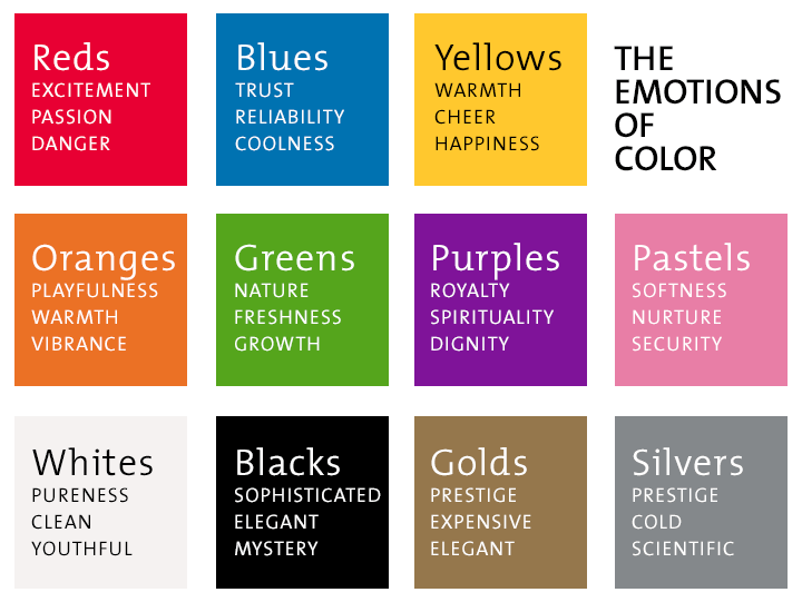
Countless studies have shown that people mentally connect colors with certain ideas and emotions. Those connections can differ based on age, gender, nationality, and other factors. Certain colors can attract a specific type of customer and can significantly impact people’s behavior.
If you’re experimenting with different color schemes for your CTA, stay within your brand’s color palette, but otherwise, go nuts.
Bold colors and eye-catching button designs work best, so put together a couple variations, run them through some A/B testing cycles, and see which one results in the highest conversion rate.
Test Different Content Lengths
Depending on the nature of your business, you may need to explain a lot about what you want a prospect to do, or it may be something that requires only a few words.
Even with that distinction, finding the perfect content length can be challenging.
If you’re trying to get your website visitors to fill in a form describing a construction project, you have some explaining to do before they can execute your CTA. On the other hand, if you sell a simple product, you may only need a “Click to Buy” button. In that case, you can get the job done with just three words!
Brevity is important, but so is being absolutely clear about your message, so create a few different versions of your site with different content lengths and use A/B testing to find the best one.
Step 9. Show that Your Current Customers Love You
Prospects trust existing customers to tell them the truth. It’s part of a harmless us-vs-them mentality that pits ‘us customers’ against ‘them sellers.’ When you’re the seller, you can use that trust to your advantage.
Include Testimonials & Consumer Reviews
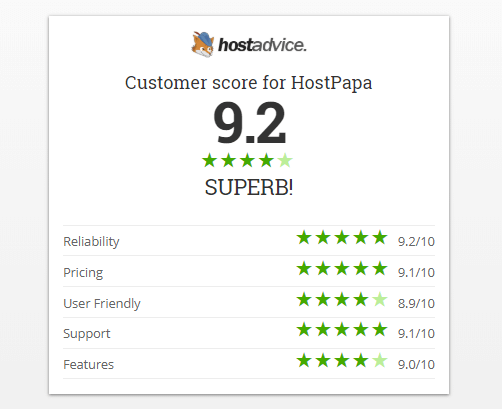
If you have a couple of long-term clients, ask one of them for a testimonial and post it on your site. As long as it comes across as honest and unbiased, reading one of your success stories will give prospects a lot of confidence in your company.
Consumer reviews are also very influential in convincing prospects to purchase your product or service. It’s that us-vs-them approach again—for some reason, customers believe other customers much more readily than they do the seller. We may be cynical, but it’s human nature.
If you have reviews that highlight how delighted your current customers are with your offerings, they should be prominently displayed on your website.
Brag about Your Social Media Followers
If you use social media as part of your marketing strategy, you may have amassed an impressive number of followers. Seeing evidence that loyal customers like your company enough to follow you on Facebook and Twitter, tells prospects several things:
- You provide enough useful content to attract a following.
- Your customers love the products and services you offer.
- You’re savvy about the best way to maintain good customer relationships.
Even for prospects who aren’t personally into social media, knowing that you connect in that way with a large number of existing customers creates an impression of professionalism and success.
Step 10. Optimize Ad Copy
If you drive traffic to your site with ads of any sort, the ads should prepare your prospects for what they’ll find there, including what you want them to do.
Create a Seamless Flow
When a customer gets their first impression of your company through an ad, there needs to be a consistent look and feel shared between the ad and your website. The design and copy of your ad should match perfectly with that of your site.
Facebook ads should look like a miniature version of your homepage.
If prospects come to your site from a PPC ad, ensure that the ad copy sends the same marketing messages as the content on our site.
Use Ads to Preview Your CTA
You can start preparing site visitors to execute your CTA before they even get to your website.
If your CTA is simple, let your ad stress how fast and easy it is for customers to buy from you. If your CTA is more complicated, an ad is a perfect place to start laying the groundwork for a conversion.
Watch Your Conversion Rate Skyrocket
Phew, it seems like we just covered a lot of territory.
While there are many moving parts when you’re trying to maximize your website’s conversion rate, each individual factor is manageable when tackled alone. Every improvement you make, no matter how big or small, will increase your site’s performance.
Have you implemented any efforts to increase conversion rates on your website? Let us know in the comments.

